
Meraki Health - Client Details
Overview
Meraki Health is a suite of tools and analysis to assist wireless administrators by providing each client’s unique perspective of connectivity to the WLAN, allowing network administrators to drill down into client issues and have visibility into the connection state of a single wireless client. In this article, we will look at the following Meraki Health components for statistics from a client's perspective:
- Current client connection
- Client connections
- Client performance
- Client history
- Client onboarding and performance metrics
Learn more with this free online training course on the Meraki Learning Hub:
Sign in with your Cisco SSO or create a free account to start training.
All the mentioned components can be found by navigating to the Client Details page from Network-wide > Monitor > Clients on the dashboard.
Please refer to the following documentation for more information on Meraki Health:
- Meraki Health - MR Access Point Details - Meraki Health components from an access point's perspective
- Meraki Health Overview - Meraki Health as a suite of services
Current Client Connection
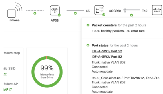
From the Meraki dashboard, navigate to the Network-wide > Monitor > Clients page. Once there, select an individual wireless client and open the Client Details page. On that page, a schematic of the client connection to the network is depicted, as shown below.

The diagram provides a snapshot of the current or most recent client connection and the path to the network's layer 3 gateway. Administrators are able to hover over each icon and link to gain visibility into different metrics that dictate the health of a connection or device along the path. Metrics such as RF channel utilization, traffic usage, interface port statistics on a switch, as well as packet loss on a security appliance will be shown and categorized as "Good," "Fair," or "Degraded." This helps identify the root cause of an individual client’s poor wireless experience. The admin can now take actions to remedy the problem and then confirm from the client connection path that all metrics are in a "Good" status.
The wireless client is depicted as a blank square, and it connects via a wireless link to the AP. Each device and link can be reviewed for the current state for the client's connection. The following table provides a brief overview of the data available by hovering the mouse over icons and links.
| Link or Icon selected | Description |
| Wireless client to AP link |
This link will show the SSID the client is connected to, as well as the current data speed (uplink/downlink). |
| MR access point icon |
The access point icon shows the device type, LAN IP address (showing whether it is DHCP or static), and usage data.
|
| MR access point to MS switch link |
This link's metrics include counters for packets forwarded on the link, the port status (connected, disconnected, duplex, and link speed), and basic configuration of the connecting switch port (VLAN and port mode).
|
| MS switch icon |
The switch icon shows device name, model, and LAN IP, as well as details about network services seen by the switch. It will show a "Good" state if there is no connectivity-related alert, a "Bad" state if the device is unreachable, and a "Warning" state for issues with the switch's connectivity to the dashboard or for any service-related issues.
|
| MS switch to MS switch link |
This link's metrics include the dashboard connection status counters for packets forwarded on the link, the port status (connected, disconnected, duplex, and link speed), and basic configuration of the connecting switch port (VLAN and port mode).
|
| MS switch to Cisco Catalyst device |
In many topologies, an MS switch may act as an access layer/distribution, with a Catalyst Switch or router at the core of the network. When an MS's uplink is directly connected to a Catalyst device, and that Catalyst device is running LLDP, the dashboard is able to draw connectivity states and provide LLDP information in the path.
|
| MS switch to MX WAN appliance link | The link between the WAN appliance and a switch will show packet counters and port status metrics such as trunk status, number of forwarded packets, native VLAN, and duplex information, similar to an MR access point to MS switch link. |
| MX WAN appliance icon |
The MX WAN appliance icon will show device name, model, and public IP, as well as details for device connectivity and usage. Statistics include loss and latency to a given IP for uplink latency and packet loss, as well as usage over a given time period.
|
Please note that links to switch stacks and link aggregated ports across stack members will not be shown in the Client Health widget. Mesh links might not be shown the right way in case there are APs that do not support the MR 27.X firmware version.
The Client Health widget does not currently support non-Meraki or non-Cisco Catalyst devices.
Client Connections Tab
When you navigate to Network-wide > Monitor > Clients and select a specific client, to the right of the Overview tab on the Client Details page, the Connections tab displays overall connection statistics specific to the selected client on the network. The components of this tab are described in the following sections.

On the Client Connections tab, network administrators have the ability to both view and classify connections according to the time span, SSID, individual access points, frequency bands, or a combination of all these parameters.

- The data displayed can be as recent as the preceding hour or as far back as six months ago based on the specified timeframe.
- To view connection data specific to an SSID, click on the drop-down to view the SSID list. You can either select the desired SSID or type it in the SSID field.
- To view connection data specific to an AP, select the AP from the drop-down or type the AP name into the search field.
- To view connection data specific to a frequency band, select the 2.4 Ghz, 5 Ghz, or 6Ghz band from the drop-down menu or type in the band in the search field.
A combination of these filters can also be used to view connection data specific to the client as required.
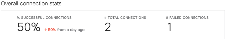
Overall Connection Stats
The data shown in the Overall connection stats table is subject to the filter parameters of time duration, SSID, AP tag, individual AP, and band selection, if any have been selected.
Issues by SSID and Problematic APs
Below the overall connection stats table are lists of both the SSIDs and the APs a client connected to and experienced problems with. This information can be filtered by the following connection steps:
- Association
- Authentication
- DHCP
- DNS
- All failure steps
Problematic Connection Steps
This section provides a breakdown of the failure stages as a percentage of the overall failures experienced by the client. This provides visibility as to where the problems lie for the client not being able to connect and/or pass traffic.
Example
In order to understand the statistics reported and how to navigate this information, we will consider a simple example where a client faced authentication failures to the "Corp Secured" SSID, as seen below for one of the two association attempts.
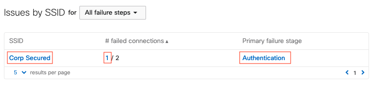
All of the features represented by a red highlight above are clickable links, which can be followed to gather more information on the problem:
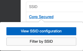
- Clicking on the SSID allows you to view the access control configuration or filter the client connections by that SSID.
- Clicking the number of failed connections or the primary failure stage links redirects to Wireless > Monitor > Access Points > Connection log, with filters for the client and SSID applied, as seen below.
- In the Connection log, the failure reason "Client failed 802.1x authentication to the RADIUS server" is provided. The info bubble next to this reason provides possible causes of this problem, such as RADIUS server misconfiguration, VLAN misconfiguration, etc.

A breakdown showing the failures at each step of the connection is also shown on the Connections tab. It classifies each of the failure stages as a percentage of the overall failures experienced by the client. Clicking any of the numerical values directs to the above-mentioned connection logs table with a corresponding filter applied. From the diagram below, in our example scenario, 50% (Total:2, Pass:1, Fail:1) of the connections by the client are failures. There are no other points at which the connections fail (0% failed to associate, 0% failed DHCP, 0% failed DNS, and 0% failed to pass traffic).
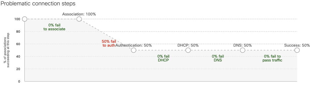
The success rate of all connections is (100% - 50% fail to auth) =50%
Client Performance Tab
Performance for individual client devices can be seen by navigating to Network Wide > Monitor > Clients then selecting the specific client. This tab will show you all of the performance metrics around that specific client. This data can be filtered according to a period of time, a specific SSID, a specific AP that a client is connected to, or for a specific wireless band (i.e. 2.4 GHz, 5 GHz, 6Ghz, or all).
Note: The Performance tab and the content on it are supported with firmware versions MR27.1 and above. Please check the APs that support this firmware version. In case of legacy APs being present in the network, all graphs might have gaps in the information shown since most of the information is pulled from multiple APs.
The graphs represented under the Performance tab are described in the following sections. There are two additional connectivity bars present on the X-axis of these graphs.


Purple bar segments on the X-axis of the graphs below represent events that may affect wireless performance. The events include changes made to RF configuration, DFS events, and others. The shade of these bar segments correlates to the number of events seen.

Blue bars on the X-axis of the graphs below represent when the client was connected to a given access point. Gaps between the blue bar segments indicate times when the client was disconnected or switching APs.
Usage
The Usage graph shows the bandwidth consumption of the client in the specified time range across all APs. We further narrow down the data to the top-used application by the client and highlight them on the left panel, as seen in the below screenshot. Hovering over the graph will provide exact value in terms of usage at a given time stamp.

Just below the Usage graph, you can see the additional connectivity bars explained above. The purple bar shows events for client connections, e.g. association, authentication, disassociation, in the time span defined. The blue bar shows wireless connectivity on a given AP within the defined time span. This information can be used to identify clients bouncing between APs or not having connectivity at all at a specific time.
Note: The value on the Y-axis for usage is not maximum and is only a scale for perspective. A user can hover over the maximum peaks of the graph to get the actual value. This is applicable for all graphs in the client Performance tab.
Signal Quality
The Signal quality graph will show either the RSSI or the SNR value for the client in the specified time stamp. The graph has a selector for RSSI or SNR. On the left panel of the graph is a pie diagram showing the average SNR or RSSI value above a specific threshold value. Again, this graph will have the two client connectivity bars as explained above, overlaid for better understanding of the client connection, as the signal quality changes over time. The graphs are also colored for a better understanding of the signal quality. Hovering over the graphs you can see the actual SNR or RSSI value at any specific time stamp.
Average Wireless Latency
The Average wireless latency graph measures the latency for all the packets across the wireless medium for the selected client device. Hovering over the graph will show information on the actual wireless latency value, which does not take into account the QoS tags or any specific types of packets. This value is calculated based on all the packets sent over the wireless medium to the client device. The graph has a selector to view the slowest APs in terms of wireless latency. Once this is selected, the dashboard will highlight the APs which have the highest average latency to which the client connected in the selected time span. The average latency for an AP is calculated by averaging the wireless latency for individual clients connected to a given AP. Based on the average latency for all APs, the slowest APs in the network will be shown in the slowest AP list.
AP Channel Utilization
AP Channel utilization is seen on the AP to which the client is connected in the selected time span. The dashboard will automatically pull information from multiple APs as the client moves between them in a given network. This graph presents information from multiple APs as a single graph.
There is a selectable field to view either 802.11 traffic, interference (non 802.11), or both. The graph overlays AP channel utilization with connectivity bars in order to provide clear understanding for client connectivity.
AP Usage
The AP usage graph shows the utilization of the AP over the selected time span. This value is added from all the clients connected to the AP at a given time. As clients roam between APs, information is pulled and shown in a simple graph for better understanding. Hovering over the graph allows you to see the actual value for utilization over a given time.
AP usage is the wireless throughput on the AP where the client is connected at a given time. As clients roam to different APs, information is pulled from those APs. Hence, the information shown on this graph is not from one AP, but is pulled from all the APs the client has roamed to in the selected time span.
AP # of Clients
The AP # of clients is a value pulled from all the APs where the client has roamed. Based on the time stamps when the client roamed to another AP, the dashboard has created the graph for better understanding.
Hovering over the graph allows you to see how many clients were connected to the AP at a given point of time. As you hover over another time stamp, the information might be from a different AP to which the client has roamed.
Data Rates
The Data rates graphs shows the rate at which the client is connected to the AP. As the client roams across multiple APs, the dashboard pulls this information from the APs at different time spans, as required. You can select either the Absolute view, to see the data rate value used by the client, or the Normalized view, to see the data rate used compared to the maximum data rate supported by the client.
Hovering over the graph will show the exact data rate at a given time for the client. The graph is also colored based on the data rate values used for connection. In the data rates graph, there is a selector that allows you to choose between All traffic, Upload, or Download. Also, the Data rates graphs are overlaid with connectivity bars as explained above.
In this example, the client has been using a data rate of 495.5Mbps:

and the normalized data rate is 21% client max.

This is because based on the Overview section of the client, it supports a Maximum bitrate of 2402 Mbps.

Client Timeline Tab
The client's History seen under the Timeline tab is designed to show historical information about events for the client device. The main function of this tool is to understand if the connection was successful or not. In order to provide more information around the connection, we have captured other variables, such as which AP the client was trying to connect to, the time to connect, and the SNR value for the connection.

There are multiple selectors available for this tool, such as the SSID, ACCESS POINT, BAND, CONNECTION STEP, and STATUS, as shown in the above screenshot.
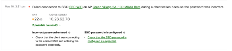
If the SSID is an 802.1X authenticated SSID, we will capture the active RADIUS server’s IP address as well as the reason code, in case the connection is not successful. A sample of failed authentication can be seen in the below screenshot.
Additional information may also be provided by the dashboard regarding possible causes as to why the connection might have failed, along with potential remediation steps to help a network administrator troubleshoot the issue. Administrators can look into their RADIUS server codes to get additional data for troubleshooting. The screenshot below shows the possible causes and the remediation steps outlined in the history tab itself for a failed 802.1x connection.
Apple Analytics
Meraki Health solution will be able to identify unique disassociation codes as Apple devices disconnect from Cisco Meraki APs. This allows network administrators to understand and identify issues from a device perspective without taking any pcaps. Here is a list of disassociation reasons that can be uniquely identified today.
| Failure reason | Description |
|
DHCP failure |
Client did not obtain an IP address and hence disassociated from the AP. |
|
EAP timeout failure |
Client device was not able to complete the EAP handshake with the AP and hence disassociated from the AP. |
|
802.1x failure |
Client device failed the 802.1X authentication with the RADIUS server and hence disassociated from the AP. |
|
Device idle |
Client device has been idle for a long time without sending any traffic to the AP and hence disassociated from the AP. |
|
Captive portal failure |
Client device failed to complete the captive portal process and hence disassociated from the AP. |
|
Decryption failure |
Client device failed to decrypt the traffic from the AP and hence disassociated from the AP. |
|
Station interface disabled |
Client devices disabled the WiFi interface which in turn triggered the disassociation from the AP. |
|
User triggered disassociation |
User disconnected from the SSID on the client device which in turn triggered the disassociation from the AP. |
|
Excessive beacon loss |
Client device was not able to listen to the beacons from the AP and hence disassociated from the AP. |
|
Other reasons |
Disassociation message was received from the client device without a reason code. |
The above-mentioned disassociation reasons are only applicable to Apple iOS devices. A firmware version of 28.1+ is required to get this information in the dashboard.
Intel Analytics
Based on the Cisco-Intel partnership, we are enabling additional reason codes to be enabled with Intel based devices. Using this partnership, Cisco Meraki APs will be able to pull in additional insights from the client devices that use Intel WiFi adapters. Cisco Meraki APs will also be able to pull in roaming insights from the Intel adapters and also perform an in depth analysis of the OS and power source information. This will add more information to the client information made available in the dashboard for a network administrator. Presently, the dashboard will be able to show Intel client roaming reasons in the Timeline tab for a specific Intel client device.


Some of the events seen include low RSSI, beacon loss, AP recommendation (11v), Bluetooth interference and Better AP.
Note: Only Wi-Fi 6 and above APs running 28.3+ firmware version will be able to gather and display Intel analytics in the dashboard.
Note: 802.11w must be enabled in order to get Intel client's information in the dashboard. Also, the client device needs to be updated to 22.85+ or higher driver version for this information to be reported to the dashboard.
Sticky Client Detection
As a part of Meraki Health, the dashboard will now be able to identify and highlight a sticky client situation using scanning radios on APs. Sticky client situations may arise on client devices due to multiple reasons, some of which are:
- Client device driver is not updated to account for roaming in RF environment
- Coverage holes in the network with no other AP for client to connect
- The client is on the edge of the cell and has low SNR value, etc.
All APs using their scanning radio can listen to the communication from a client device to any other AP that is in their RF vicinity. The dashboard will perform the sticky client computation individually for every client device in the network, providing for a bigger network-wide umbrella of coverage for sticky client detection. When the dashboard detects a sticky client situation, it will show a new UI element in the Wireless > Monitor > Clients > Timeline tab.
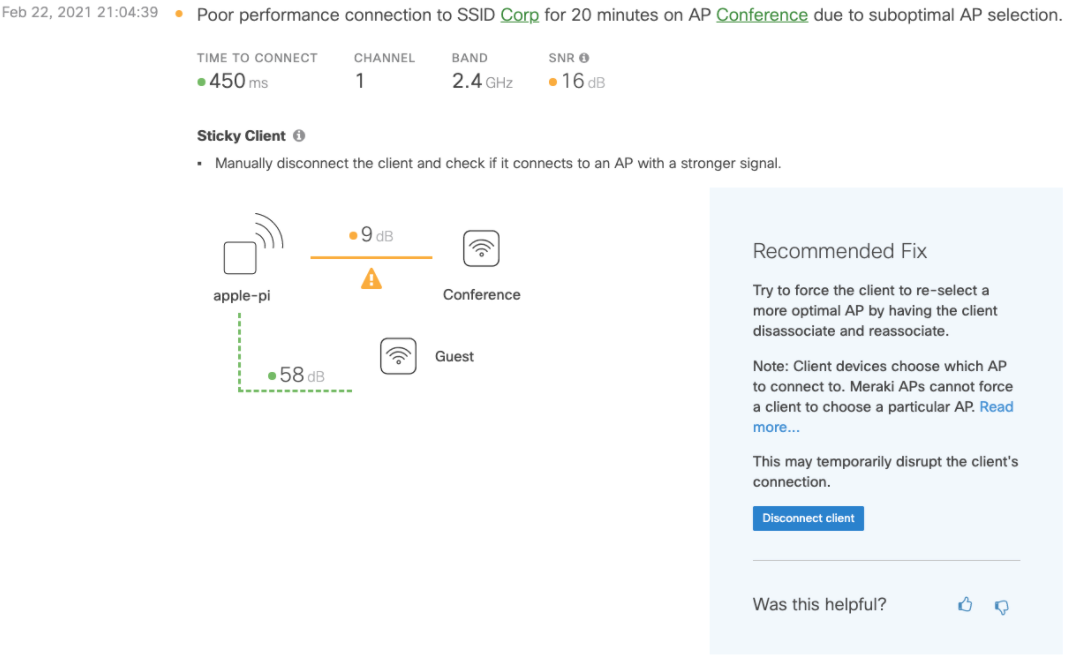
As shown in the above screenshot, the client “apple-pi” is having a suboptimal experience. The SNR to “Conference" AP is quite low. This information has been taken from the scanning radio of both APs and the dashboard has identified that if the wireless client is moved to “Guest” AP, it will have a higher SNR value, resulting in better performance as compared to the existing connection.
Disconnect Client
The dashboard will provide an option for the network administrator to make a choice to disconnect the client device from the original AP with the expectation that the client will connect to the better SNR AP to avoid this sticky client situation, as seen in the previous screenshot. Clicking on the “Disconnect client” button will trigger a disassociate from the “Conference” AP to the client device.
Roaming decisions are made by the wireless client device, and there is a possibility that the client may choose to connect to the same AP after attempting to disconnect the client device. We cannot guarantee that the client device will connect to one of the recommended APs, as the end-roaming decision will be on the client device.
Disconnecting a client device is a disruptive change as it triggers the device to reassociate with a newer AP or the same AP. This will cause any active session on the wireless client device to drop and reinitiate.
As a network administrator attempts to disconnect the client device, the dashboard will show a live status from the AP. This will inform if the client makes the move to roam to the correct AP or attempts to connect back to the same AP. Currently, the dashboard can identify up to a maximum of three candidate APs that may have better SNR, as compared to the existing connection for sticky client detection.
Additional Steps
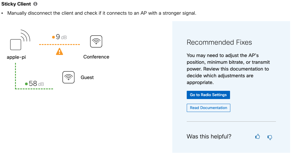
If the client device reconnects back to the same AP, the dashboard will be able to identify this behavior and provide additional solutions. As shown in the above screenshot, the wireless client did not connect to the “Guest” AP as intended. In this case, the dashboard will provide a few more options to avoid such behaviors in the future. Also, in order to improve our recommendation engine, the dashboard will capture any feedback provided for these recommended tools, depending on the usage.
Since this a transient issue, this notification will be cleared from the dashboard if the client chooses to move to another AP. The client device will need to be in the sticky client situation for at least five minutes before the dashboard displays this information in the form of a tile in the client's History under the Timeline tab.
Poor Coverage Area Detection
Using the inbuilt dedicated Scanning radio, Cisco Meraki APs will be able to detect and notify dashboard administrators about poor coverage areas in the network. Using RSSI values from the wireless clients and the neighboring APs, a poor coverage area can be identified in the network. The Meraki dashboard has an intelligent algorithm built in where this behavior is observed for a specified amount of time before notifying the dashboard administrator about a poor coverage area. Once this has been identified, any client entering in the poor coverage area and staying there for a period of time will be flagged and notified in the dashboard.
In a coverage hole, the client will experience poor SNR and will reduce the data rate, thus resulting in a poor client experience. These issues are difficult to capture and could be transient as well. Below is an example of how a coverage hole will be highlighted in the dashboard:

The Poor coverage area detection feature will be supported by APs running 28.5 and above firmware versions in the dashboard.
Client Onboarding and Performance Metrics
The dashboard will capture onboarding and performance metrics for client devices connected to any wireless SSID in the network to display per-client onboarding and performance scores. The onboarding parameters are defined by the following four steps that the dashboard monitors:
- Association
- Authentication
- DHCP
- DNS
If there are failures in these steps, the dashboard will change the onboarding metrics for a client device. This will help isolate the client devices with the most issues connecting to the wireless network.
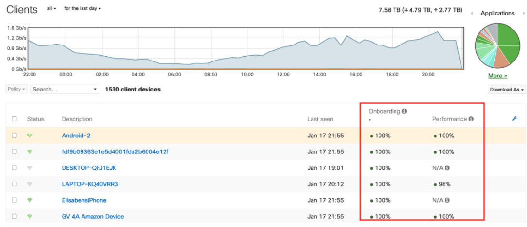
Similar to onboarding metrics, the dashboard will also keep track of the SNR of every client device and provide a performance score. An SNR value of 16dB is considered good for a client's performance. These onboarding and performance metrics are calculated over a period of two hours while the client is connected to the AP and the time range selected at the top of the page.
If the dashboard does not have enough data within the past 2 hours, or if it's a wired client, the Onboarding/Performance columns will show N/A in the respective fields. This includes clients that are connected to the network but are not sending any traffic or are connected to an AP that cannot run firmware MR27.5 or above.
A client may also show N/A in the Onboarding column if there is no connection activity in the past 2 hours from that specific device.
Disconnecting Wireless Clients
A disconnect client button is available within the Client Details page for each wireless client actively connected to an AP. Clicking the disconnect client button will trigger the AP to send a disassociate message to the client device.


Wireless clients may connect back to the SSID even after sending the disassociation message. Constantly disconnecting a client device may cause the wireless client to blocklist the SSID.
This feature is enabled for all networks running 28.5 and above firmware versions.