Meraki Health - MR Access Point Details
Overview
Meraki Health is a suite of tools and analysis to assist wireless administrators by providing each client’s and access points' unique perspective of connectivity to the WLAN, allowing network administrators to drill down into client or access point issues in detail. In this article, we will look at the following Meraki Health components for statistics from an access point perspective:
- AP Summary tab
- AP Device Health tab
- AP Performance tab
- AP onboarding and performance metrics
Learn more with these free online training courses on the Meraki Learning Hub:
- Troubleshooting Wireless Client Connectivity
- Troubleshooting Wireless Client Performance
- Troubleshooting Wireless Network Connectivity
- Evaluating Wireless Network Performance
Please refer to the following documentation for more information on Meraki Health:
- Meraki Health Client Details - Meraki Health components from a specific client's perspective
- Meraki Health Overview - Meraki Health as a suite of services
AP Health
Managing and monitoring your wireless network is always tricky. How do you know when you're RF is healthy? Can you easily see the state of your radios, or just the AP in general?
Radio Statuses
In our code prior to release 32, it could be a little confusing to know at a glance the state of the radio.
In the radio list view, even if Radio’s Tx was set to off, the status icon will still show green.
r31 and previous

r32 and greater
With release 32 and beyond you can more easily see the status of each radio. You can now differentiate the status of the radio based on the status icon.
![]()
- Up - Radio active, Normal operation
- Down - Radio down, Radio Interface Failure
- Off (auto) - Radio turned off by AI-RRM
- Off (admin) - Radio turned off by Admin
- Unable to fetch - could not fetch the status of the radio
Radio status Dormant uses the same iconography as Down

AP Summary Tab
The AP Summary tab can be found upon selecting an access point from the list in Wireless > Monitor > Access points. It will extract information on a per-AP level and display the wireless health metrics on the AP summary page itself. The below graph will be enabled on the APs in any wireless network.
Clicking on the above widget will take you to the updated event log page for the specific AP. This page will display all the issues encountered by client devices on a particular AP.
Device Health
The Device Health tab, accessible under Wireless > Monitor > Access Points, offers a comprehensive view of key metrics to evaluate the performance and stability of Access Points. This feature is critical for identifying and diagnosing issues related to the AP control plane, ensuring seamless network functionality.

System Resources
The System Resources component displays a historical view of AP CPU load and Memory utilization. These metrics enable proactive troubleshooting for network issues caused by potential CPU overuse, memory leaks, or connectivity disruptions around AP to cloud connection and AP to network connectivity. CPU and Memory statistics have three status classification - good / fair / poor. each classification follow below range
0 - 75 % : good
76-85 % : fair
86 % or higher : poor

System Status
The System Status component provides real-time visibility into the AP's current power consumption and the PoE source connected via wired ports. This allows for the quick diagnosis of power-related performance issues. The real-time power consumption tab may not be available for all AP types. This section will remain empty if an AP doesn’t have a real-time power consumption probe.

The Power mode status shows the AP's historical power operation over 24 hours. This metric can be used to verify whether the AP is operating in a degraded power mode that could impact expected operational behavior.
Note: Under Consumption by AP, instead of number of watts you could see No consumption by AP data available. That could mean the AP does not support the real-time power consumption feature. If that's the case, power can still be monitored via the switch page from the PoE port to which the AP is connected to. To confirm if this is an AP limitation, please reach out to the Meraki support team.

AP reset
The AP reset graph tracks the AP’s operational status over 24 hours. If the AP encounters a planned or unplanned reset, the event will be logged in the timeline. This provides the ability to recognize patterns of instability within the network.

Note: The current implementation does not distinguish between an AP reset and downtime in dashboard.
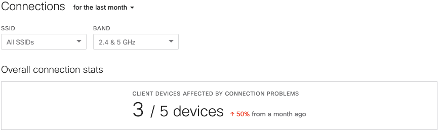
AP Connections Tab
The AP Connections tab can be found under Wireless > Monitor > Access Points > Selected AP's status details page. This tab will show an aggregate of all connections through the access point, as opposed to that of an individual client. The connection stats can be filtered by duration (up to a month’s worth of connections are stored), by SSID, or both.
Overall Connection Stats
The overall connection stats will show the total number of connections that faced issues based on the SSID, frequency band, or duration filter, if applcable.
Issues by SSID and Problematic APs
Below the overall connection stats table are lists of both the SSIDs and the clients that connected the AP and experienced problems. This information can be filtered by connection steps:
- Association
- Authentication
- DHCP
- DNS
- All failure steps
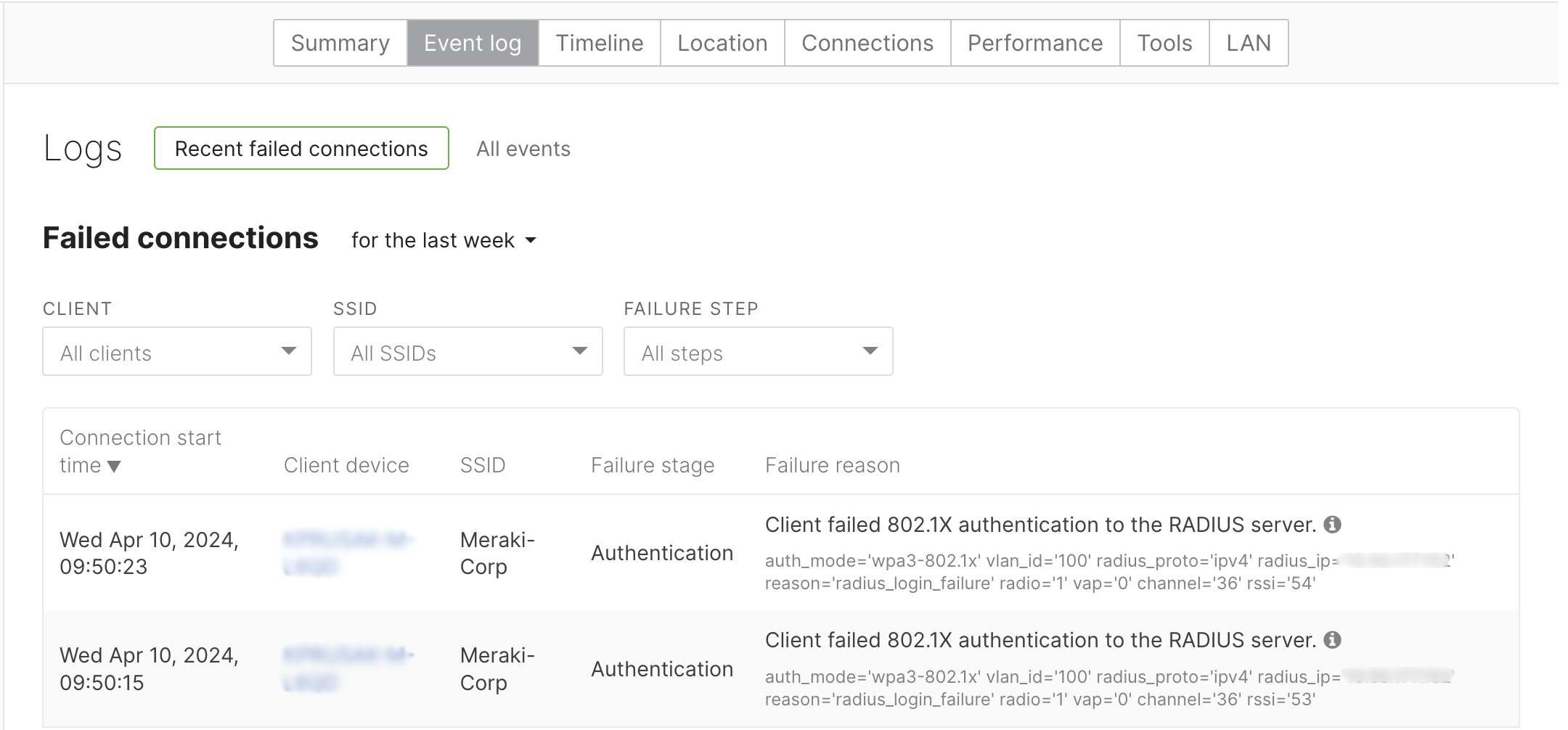
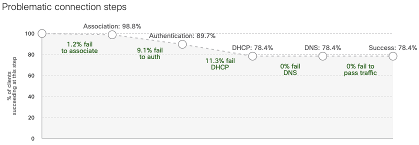
Problematic Connection Steps
A breakdown showing collated client failures at each step of the connection is also shown. It classifies each of the failure stages as a percentage of the overall connection failures seen by the access point. This provides visibility into problems that multiple clients are having when connecting to and passing traffic on the particular access point. Clicking any of the numerical values directs to the failure reasons table with a corresponding filter applied. It will display the number of clients experiencing the same failure.
Example
See the diagram below as an illustration. Of all the client connections through the AP, 78.4% successfully connected, 1.2% failed to associate, 9.1% failed to authenticate, and 11.3% failed DHCP. All the numerical values are active buttons and clicking on them directs to the failed connections of the AP event log.
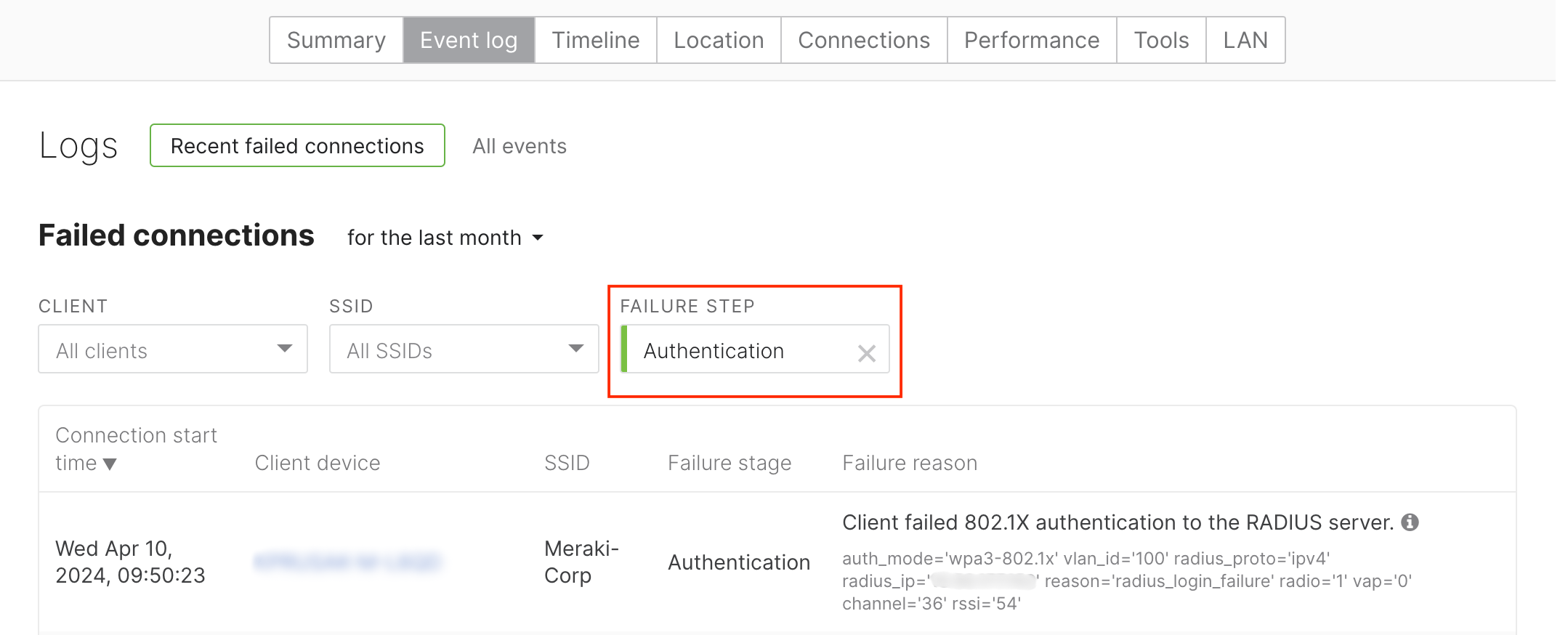
Clicking on the "9.1% fail to auth" failure step will take you to the Event Log tab with a pre-applied filter, as shown below. The table can then be filtered further using the parameters of time duration, client, SSID, or failure step.
AP Performance Tab
The Performance tab can be found upon selecting an access point from the list Wireless > Monitor > Access Points. It is used to see different metrics around how the AP is performing with the wireless clients connected to the AP. There are multiple parameters that the dashboard will display in a graphic format manner for easy understanding. A time selector is present at the top that will change the graphs depending on the time stamp selected. Also, a network administrator can look for a specific SSID or band of interest when selecting and monitoring all the performance graphs.
Note: while both the AP performance tab and the wireless health tab both pull information from the same sources over the same time span, the performance tab is not able to capture variations in the overall volume of packets processed, which may lead to inconsistencies seen between the two tabs.

These graphs also have an additional connection events bar below the X-axis. Purple boxes on the x-axis of the graphs represent events that may affect wireless performance. The events include changes made to RF configuration, DFS events, and others where the shade of the box represents the intensity of these events.


Usage Graph
The usage graph shows the amount of wireless data AP is transferring over time. The graph is overlaid with AutoRF information so you can see the auto TX power and auto channel changes over time.
Hovering over the graph shows the actual usage at a specific time stamp.

Note: The maximum value on the Y-axis is for scaling purposes; you can hover over the peaks in the graph to understand the utilization of the AP.
Clients
The clients graph shows the number of active wireless clients connected to the AP across the time span selected. Higher numbers of clients on one AP may result in poor performance and higher channel utilization. This graph is overlaid with AutoRF events for the specific AP. Hovering over the graph in the purple bars will show the number of clients along with any AutoRF change that might have occurred in that selected time frame.

Note: The maximum value on the Y-axis is for visual representation only. Hovering over the peaks in the graph will give the actual maximum number of clients.
Average Signal Quality
The average signal quality graph has a custom selector for RSSI value SNR value. Depending on the selection, the representation of the graph will change. The dashboard will average the value of RSSI for clients connected to the AP at a given time and display it in the graph. When troubleshooting wireless issues in a specific area, this graph can help you understand if the signal quality has dropped over a specific time span.
The graph is overlaid with AutoRF events indicated by the purple bars on the X-axis. The graph will also change colors indicating lower signal quality across all clients.

Average Wireless Latency
The average wireless latency graph calculates wireless latency for individual clients connected to the selected AP and averages the value for the connected clients at any given time. This provides an overview of latency across the clients connected to a selected AP.
Hovering over the graph peaks provides the maximum wireless latency on the AP. The dashboard will also create a list of slowest clients connected over time, and you can choose this tab from the selector shown above. The graph is overlaid with AutoRF events and also is color coded to highlight overall wireless latency. This can be used to identify specific clients that are exhibiting slowness when connected over the Wi-Fi network. If there is a spike in latency for a specific client, a network administrator can look into the client’s performance tab in order to isolate a specific issue.

Note: The maximum value on the Y-axis is for scaling purposes; hovering over the peaks in the graph will provide the actual average wireless latency
Channel Utilization
The channel utilization graph displays a percentage value of channel usage by the clients operating on that channel. The graph provides a selector that allows you to choose between 802.11 traffic and interference (non-802.11). As the channel utilization goes up, clients may see higher latency and reduced throughput. Hovering over the graph provides the channel utilization percentage value at a given time stamp. The graph is overlaid with AutoRF information for better understanding. Using this correlation, a network administrator can visualize if a channel change was better for the wireless client connected to that AP.

Data Rates
The data rates graph is used to display average data rates across client devices connected to the AP in the selected time span. The data rates are visible by hovering over the graph. The graph also provides a selector between upload, download, and average data rates across all devices on the AP.

Note: The maximum value on the Y-axis is for scaling and is not the maximum value of data rates. Hovering over the peaks provides the maximum value for data rates in the selected time period.
AP Timeline
AP timeline is used to highlight any issues on an AP level in the network. This can be used by Dashboard administrators to view any problematic AP and check the logs for all failed clients. The logs that are shown are very similar to the Client History tab but aggregated on a per AP level. This information is available for every AP in Dashboard in the AP list page allowing a Dashboard administrator to look at specific issues at an AP level.

Note: AP timeline will only be available for networks running 27.5 and higher firmware versions. Networks running older firmware will continue to use the Event log tab on the AP page.
APs Onboarding and Performance Metrics
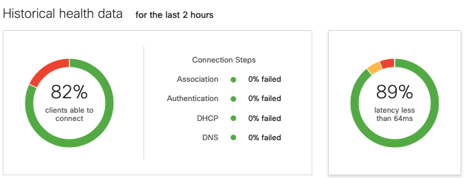
As the dashboard monitors and records the performance of each wireless client device in the network, it automatically captures failures for onboarding and performance observed across each AP in the network. The onboarding metrics can be found in Wireless > Monitor > Access points list. An access point's Onboarding score rates how reliably wireless clients are able to connect to the wireless network via the respective access point. The percentage shown is the percentage of successful connections to the network (where the client was able to pass traffic) out of the total connections they've attempted in the last 2 hours. In the below screenshot, you can see that some clients failed to connect to the wireless network for certain APs during this time frame:

Similar to onboarding metrics, the dashboard also captures performance metrics. An access point's Performance score rates the quality of the wireless connectivity for the last 2 hours. The percentage shown reflects the percentage of good SNR out of the total time connected during the last 2 hours. Performance is considered good when SNR is over 25dB, and poor at 15db and below. As SNR values drop below the 16dB threshold, the dashboard will reduce the performance score of the AP.
Both Onboarding and Performance metrics are calculated based on the past 2 hours, regardless of the timeframe selected in the dropdown menu.
If the dashboard does not have enough data within the past 2 hours, or if it's a wired client, the Onboarding/Performance columns will show N/A in the respective fields. This includes clients that are connected to the network but not sending any traffic or are connected to an AP that cannot run firmware MR27.5 or above.
A client may also show N/A in the Onboarding column if there is no connection activity in the past 2 hours from the specific client device.
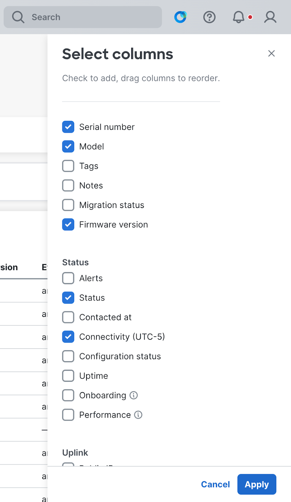
AP Flex Table
The Flex Table apart of AP List page allows network administrators to customize the display of various performance and usage metrics for APs that are joined to a network.
By clicking the gear icon in the top-right corner of the AP List table, network admins can tailor desired telemetry data from a range of categories around the node's operational, and preformance status.

The Flex Table can be configured to display columns reflecting device data such as: Model, Serial number, Operational status, Firmware version, Alerts, Dashboard connectivity, Client connections, Data usage, Radio configuration and Device uptime for unique wireless network monitoring.