
MT Sensor Readings
Overview
As each MT sensor tracks a range of metrics for various use cases, it is imperative to have a use-case-specific representation for each metric. With this in mind, the sensor details pages have been redesigned to suit the specific use case.
MT20 Door Sensor
Due to the high density data created for the MT20, the sensor details page has 3 different ways to represent data based on the time span selected for the view. Along with the Telemetry data, the new UI also shows the Alert Event and other general device level events. Please refer to the Common Event Log Messages for more details.
<24 hour view
When the time span selected is 24 hours or less, the MT20 details page will display a timeline view as shown below
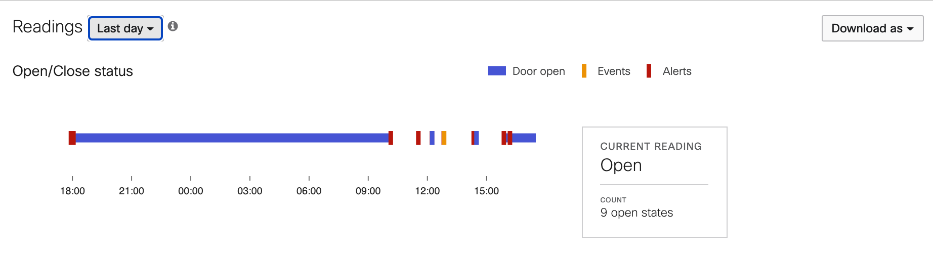
As per the legend on the view, the major elements are
- Blue Bar - The Door Open state is highlighted with a blue bar. The Door Closed state is represented by the empty space.
- Red Bar - If an Alert Profile is associated with the sensor, the red bars will track the Alert Event. On hovering over the red bar, more details including the time of Alert and Alert Name can be viewed.
- Orange Bar - This element tracks all device level events such as:
- Door Tamper
- Door Flicker
- Battery Cover
- Right Side Rail - The side rail displays the current reading and the total count of Open states during the selected time span.
Week view
The data representation changes to a heat map when the time span selected is greater than 24 hours. The week view has a compact version of the heat map as shown below
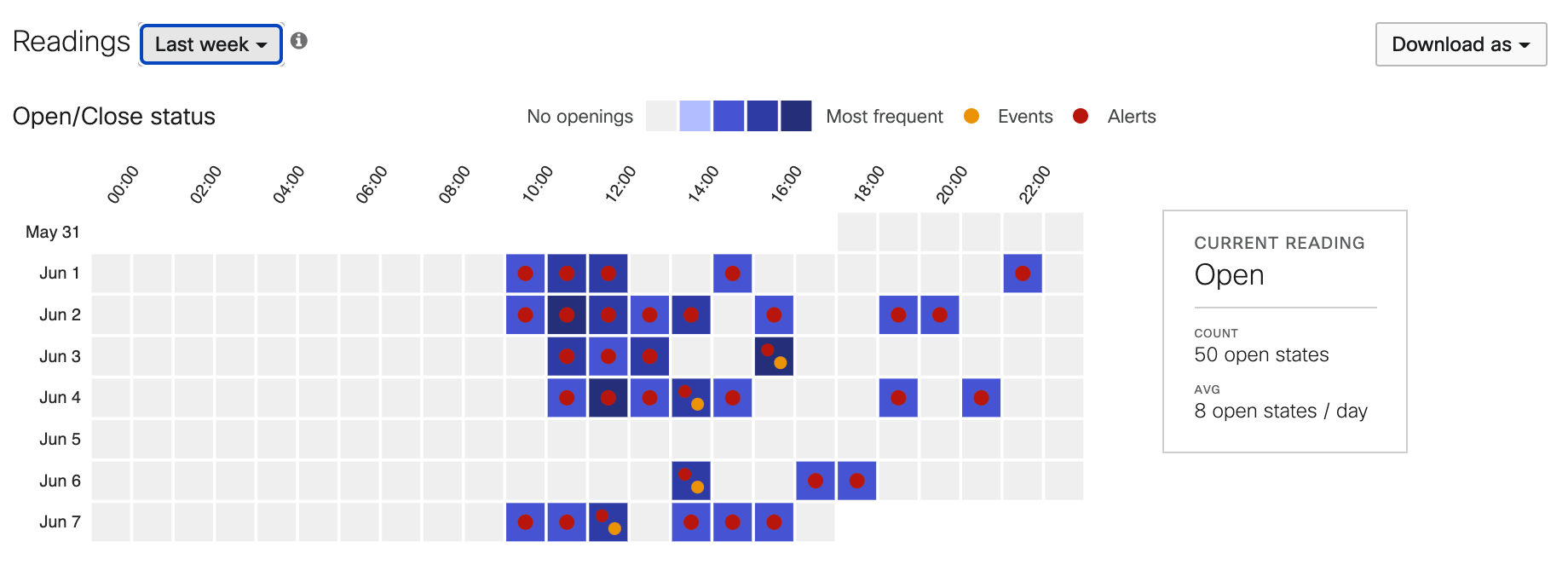
The major elements are:
- Each box on the heat map represents a 1 hour block where the blue gradient is rendered based on the frequency of Door Open events during that time frame.
- Hovering over a single box will show the total count of Door Open events as well any other event that occurred during that time period.
- Orange dot - General Device Event
- Red dot - Alert Threshold Violation
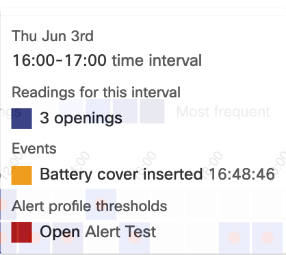
- On clicking a specific box, a timeline view is displayed for that particular time period.
- The side rail displays
- Current State
- Total Count
- Average Count of Open events per Day
Month view
On selecting a time span of greater than 7 days, the Month view is displayed. It follows the same design principle as the week view, but instead uses a more summarized method to display the data.
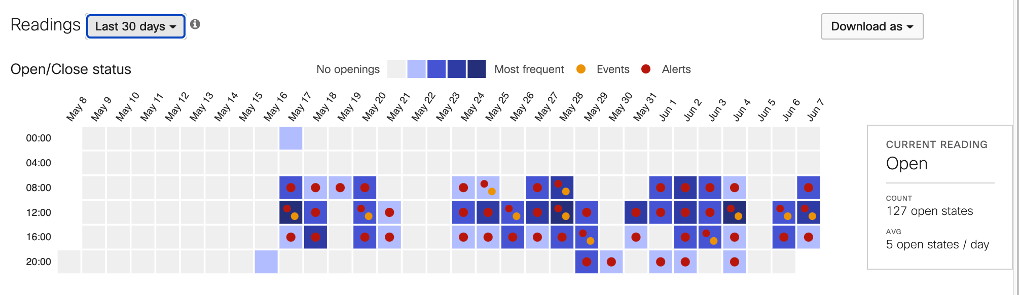
Each box on the Month view represents a 4 hour window with a similar blue frequency gradient.