
Meraki Health Overview
Click 日本語 for Japanese
Overview
Often, networks as a whole are configured correctly with no major network issues reported by users or seen on network device monitoring logs. However, even in these circumstances, there may be some clients with a less-than-satisfactory experience. Issues with authentication, association, roaming, IP assignment, and poor throughput are examples of what might be experienced by individual wireless clients, and it may not be obvious where the problem lies.
There may also be instances where a wireless admin might want to verify the effects of network changes from a client standpoint, e.g., a driver update or device refresh, a configuration change, or physical topology changes in access point location or count. The WLAN admin can now verify the new RF metrics and compare them against previously recorded baselines.
There also exist dynamic larger-scale RF environments, such as warehouses and stadiums, where the client density and signal propagation constantly change. When filled to capacity, these RF environments are very different from when they are empty, which impacts wireless device connectivity. There will be different issues to contend with when they are full, such as attenuation and absorption of signal, dense client distribution with multiple clients on a single access point, interference from other 802.11 sources, etc. As the space empties, there may be issues involving cell overlap and multipath interference as signals get reflected. Aside from variances in usage and traffic on the network, there would be no other indicators to show the unique state from the client perspective.
Meraki Health is a suite of tools and analysis to assist wireless administrators by providing each client’s and access point's unique perspective of connectivity to the WLAN, allowing network administrators to drill down into client and access point issues to have visibility into the connection state. This document will cover the information available on the Wireless > Monitor > Access points page under the tabs:
- Health
- Map
- Connection log
Learn more with these free online training courses on the Meraki Learning Hub:
- Troubleshooting Wireless Client Connectivity
- Troubleshooting Wireless Client Performance
- Troubleshooting Wireless Network Connectivity
- Evaluating Wireless Network Performance
Please refer to the following documentation for more information on Meraki Health:
- Meraki Health - Client Details - Meraki Health components from a specific client's perspective
- Meraki Health - MR Access Point Details - Meraki Health components from an access point's perspective
Wireless Overview
Wireless overview is designed to provide an overview of a wireless network from a connection and performance standpoint. This is achieved by pulling and aggregating information across all of the wireless clients connecting and sending traffic on the wireless network. The combination of connectivity and performance scores across the wireless network will help network administrators zoom into problem areas of the network more quickly and in a proactive fashion.
This page is located under Wireless > Monitor > Overview. A network administrator can select between the past 2 hours, past day, and past week from a timeline perspective and also has a filter to select a specific SSID of interest. Dashboard will also perform trend analysis on the raw values over the duration selected at the top of the page. Using our built-in machine learning model, Dashboard has pulled up the Expected values for each of the KPIs in the wireless network. These can be considered as baselines when looking at any wireless network.
Wireless networks running 28.x and above firmware version will only be able to support this page.

We have two sections that comprise the Wireless overview page. They are:
Connection Health:
Connection health will provide a high-level view of the wireless connection across the entire network. The Connection Health score is calculated by taking into consideration the number of total failed connection attempts made on the wireless network. This provides an early indicator for the network administrator around clients that are failing to connect to the wireless network. This correlates to the connection score which helps network administrators perform proactive troubleshooting before end users notice connectivity issues and create IT tickets. The categorization on the left side of the Connection Health tile will be based on the following ranges:

There are some additional metrics that will enhance the visibility of the network administrator when viewing the connection metrics on a network level. The metrics that will be part of connection health are given below. Each of these metrics can be drilled down further to get more granular information about the metrics.
1. Failed Clients:

Failed clients will provide a drill down of failed clients by SSID and a timeline graph mapping the failed and total client connections in the entire wireless network. This drill down will also show the highest impacted access points and clients that are failing to connect. If we do not see any failed clients for an SSID, the SSID name will show up with a null count in the failed client by SSID bar graph.
Clients that are failing 100% of their connection attempts will be shown in this drill down.
2. Time to Connect:

Time to connect drill down will show the average time to connect by SSID and connection step. This will help network administrators understand if there is a more systematic delay happening across wireless connections in the network. The drill down will also show the access points and clients that have a high time to connect.
Any access point that has an average time to connect higher than 5sec will be classified under impacted access point. This also applies to client devices that are having higher than 5-sec average time to connect.
3. Roaming:

Roaming drill down will show the average roam time for all SSIDs in the given wireless network. Roam time is calculated as the delta between dissociation from the first access point to the first data packet on the new access point. An average of these time intervals is termed as average roam time. SSIDs where the client devices are not roaming or do not have enough wireless clients will show a null value in this bar graph. Dashboard will also show average roam time across the wireless network.
Any access point that has an average roam time higher than 3 sec will be classified under impacted access points. This also applies to client devices that are having higher than 3-sec average roam time.
Performance Health:
Performance health will provide a high-level view of the average SNR of the client devices connecting to the access points in the wireless network. This will provide network administrators with a high-level view of the wireless network performance. The categorization on the left side of the Connection Health tile will be based on the following ranges:

There are some additional metrics which will enhance the visibility of the network administrator when viewing the performance metrics on a network level. The metrics that will be part of performance health are given below. Each of these metrics can be drilled down further to get more granular information about the metrics.
1. Latency:

Latency drill down provides information on the acreage latency seen on wireless clients per SSID. Also provides another time series graph with average latency across the entire wireless network. For SSIDs where no client devices are connecting the bar graph for latency per SSID will show a null value. Dashboard will show the impacted access points and wireless clients for Latency KPI.
Any access point that has an average latency higher than 60 ms will be classified as an impacted access point. Similarly, clients having more than 60 ms latency will show up in the impacted client table.
If the "%" change from the previous time period is < 1% it will not be displayed.
2. Packet Loss:

Packet Loss drill down shows average packet loss by SSID and across the entire wireless network in two different graphs. This will help a network administrator get a high-level overview of how much packet loss they are seeing the wireless network. Average packet loss by SSID will show all SSIDs, so for SSIDs where there is no loss or no client devices connected, a null value will be shown.
Any access point that has an average packet loss higher than 3% will be classified as an impacted access point. Similarly, clients having more than 3% packet loss will show up in the impacted client table.
3. Signal quality (SNR)

Signal quality drill down will provide the average SNR per SSID and across the entire network using two different graphs. In the first graph, each SSID will be shown, so SSIDs, where there are no wireless client devices, will show a null value.
Any access point that has an average SNR <27db will be classified as an impacted access point. Similarly, clients having less than 27db SNR will show up in the impacted client table.
The wireless Overview page will also show some high-level client and usage overview in the connection and performance tiles. These will help network administrators troubleshoot connectivity and performance issues as well as perform a more pro-active troubleshooting for the wireless network.
Health tab
The Health tab provides a network-level overview of SSIDs, client connections, and access point statistics. This enables an administrator to easily look at a specific client, access point, or SSID that has had issues reported and clearly see what the most common points of failure are. The health tab makes troubleshooting existing issues much easier, while also helping to identify potential issues that may arise in the future or areas where improvements could be made in the current deployment.
The recommended minimum firmware version for the health tab is MR 24.12 with standard dashboard licensing; no special licensing or additional fees required.
Wireless Health is accessed by going to Wireless > Monitor > Access points > Health in the dashboard. The Overview page gives a quick reference point to see the overall health of the wireless network. At a glance, the Overview page provides a quick reference for the total number of client devices facing issues from a connection and latency standpoint. The Overview page will also show the percentage of change in value over the past hour, however, the time reference can be changed to last day, week, or even month.

If the "%" change from the previous time period is < 1% it will not be displayed.
Connection Steps Graph
Below the Overview header, there is a graphic view showing client connection statistics across the entire network in a single snapshot, as seen below. This is the connection steps graph. This is very useful to understand how the overall network is doing in terms of client connectivity.

The connection steps graph quickly and easily shows each step in the process that clients go through every time they connect to an access point. This makes it simple to see at which step in the process clients might be experiencing issues. From left to right we see each step in the process, beginning with the association and followed by authentication, DHCP, and DNS resolution, culminating with the overall success rate of clients that have attempted to connect to the wireless network. As clients move through the connection process, that data is recorded and displayed as a percentage of clients who were able to successfully complete each step.
It is expected to see an overall success rate of less than 100%, as no client will always connect to a wireless network properly every time. Seeing a large drop in success rates at a certain step in the process could indicate an issue that is potentially affecting clients' abilities to connect to the network properly. For example, in the image below we can clearly see that a disproportionate number of issues happen during initial DNS resolution for connected clients, indicating that there may be an issue relating to DNS on the network.
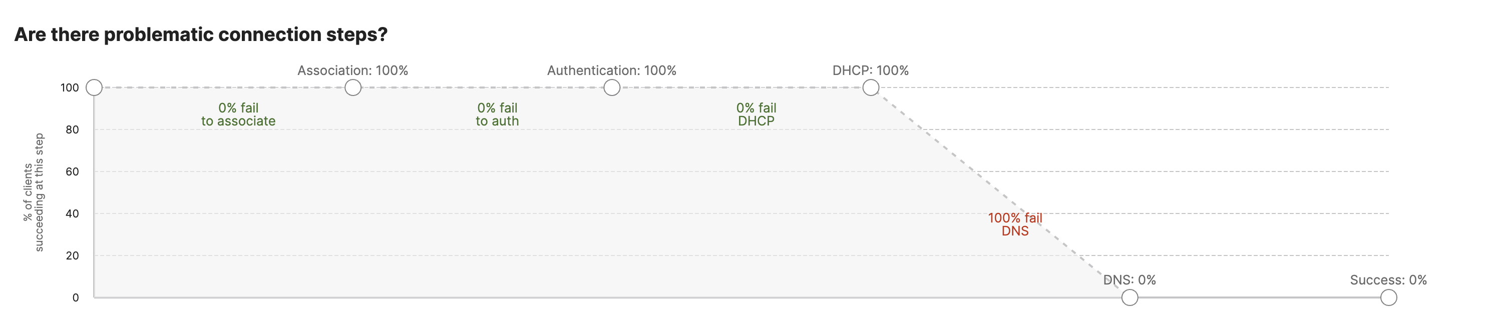
| Step | Description |
|
Association |
Shows the total percentage of clients that successfully associated to an access point out of those that attempted in the specified time period. |
|
Authentication |
Shows the percentage of clients that successfully associated that were also able to successfully authenticate in the specified time period. |
|
DHCP |
Shows the percentage of clients that successfully associated and authenticated that were also able to receive a valid DHCP address. |
|
DNS |
Shows the percentage of clients that successfully associated, authenticated, got a DHCP address, and were able to resolve their first DNS request. |
| Success rate | Shows the percentage of clients that were able to successfully associate, authenticate, get a DHCP address, resolve DNS, and pass traffic on the wireless network. |
Connection Issues by SSID
This section lists the SSID that is having the most issues along with the number of clients impacted on the SSID. The dashboard will also capture the step at which clients are facing issues on a specific SSID. This will provide a clear indication of whether the failures are on a specific SSID or across all SSIDs in the network.
Connection Issues by Client
This section lists the problematic clients that are having the highest number of issues for connection. The connection of a client is monitored across different steps: association, authentication, DHCP, and DNS. As a client device fails any of these steps, it is captured in this section. The section also shows the number of attempts made by the client device that failed, along with the step on which failure was observed.
Connection Issues by Access Point
This section lists access points in the network and the number of clients that have experienced connection issues when attempting to connect to each access point during the selected time frame. The respective Client Devices with Problems columns list the number and percentage of clients out of total devices that had more than 50% of connection attempts fail for the selected time frame. Clicking on Number of Client Devices for a specific access point will open the Failed Connections page, filtered to show only failed connections for the chosen access point.
Highest Access Point to Client Latency
This section of the page lists each access point in the network and the average 802.11 latency for clients connected to that access point, sorted by highest average latency. Latency is measured by looking at 802.11 frames and comparing the time between when the frame leaves the access point radio and when the corresponding ACK arrives back at the access point from the client. Clicking on an access point's name will take you the access point status page of the access point.
Connection Issues by Client Device Type
This section displays a list of detected client types and the number of clients in each of those those groups that have experienced connection issues when attempting to connect to the wireless network during the selected time frame. The respective Client Devices with Problems columns list the number and percentage of clients out of total devices that had more than 50% of connection attempts fail for the selected time frame.
Highest Client Latency by Device Type
This section lists each detected client type on the network and the average 802.11 latency for connected clients of that type, sorted by highest average latency. Latency is measured by looking at 802.11 frames and comparing the time between when the frame leaves the access point radio and when the corresponding ACK arrives back at the access point from the client.
Anomaly Graphs
In order to provide additional insights, the dashboard will surface an additional graph for any anomaly noted in your network for onboarding wireless client devices. This information is generated on a per-network basis and is calculated by computing up to six weeks of historic data.
Based on the historic data, the dashboard will create a smart threshold value for each sample in the historic data, shown on the graph below. This can be found in the Wireless > Monitor > Access points > Health tab in the dashboard.
When any of the onboarding steps exceeds this smart threshold value, an anomaly will be generated to indicate this, and an email can be triggered to the network administrator.

As shown in the graph above, the dashboard will highlight all onboarding failures and will map them, along with other client devices that have been successful in onboarding. This allows the thresholds to be dynamic and respond to changes in the network. The graph is overlaid with anomalies highlighted in red. To make it simpler for a dashboard administrator to consume this information, there are toggles provided in the legend that allow you to enable/disable total clients and failure threshold computed historically.
This graph will only apply filters for SSID and time duration as selected in the Wireless > Monitor > Access points > Health page.

As a network administrator hovers over the graphs, a new pop-up shows the actual values at any given point in time, and will show how many client devices are above the smart threshold graph and categorize them as anomalies.
All this information can be broken down into the four steps for client onboarding:
- Association
- Authentication
- DHCP
- DNS

A network administrator can look into the individual steps to understand how clients fail to connect and cause the dashboard to trigger anomalies.
This graph is developed in correlation with our smart threshold-based alert. The new graph UI will only show up if the smart threshold-based alert is enabled for a given network they are not available on by default.
The "All steps" tab in this graph does not display the total number (sum) of clients from the other tabs. When a client attempts to connect, it goes through a series of steps to achieve a successful connection. Each tab represents a connection step. For each step, the graph counts each distinct client MAC address as an addition of one ("plus 1") to the "total clients" for that step. Conversely, if a client does not complete a step successfully, it is marked as "failed" for that step in the graph.
Additionally, a client can abort the connection process at any point, even between steps. In such cases, the client is not marked as failed for any specific step but rather for “All Steps”. It is also possible for a client to be counted in a step even if it only performs that specific step without going through all of them. For instance, a client can perform a DHCP step at any time to renew its DHCP address without needing to go through association and authentication again. A similar situation can occur with DNS.
Map
The Map tab initially displays a color-coded map of access points. Hovering over an access point will display a pop-up showing the access point name, number of clients that have had >50% of connection attempts to that access point fail, and the percentage of total clients affected by connection issues. This information can be filtered by SSID, access point tag, and frequency band. As each access point experiences more client connection issues, it will change color:
- Green (<50% of total connection attempts failing)
- Yellow (50-75% of total connection attempts failing)
- Red ( >75% of total connection attempts failing)
Connection Log
The Connection Log shows a list of all failed connections with information about the client, access point, SSID, failure stage, and failure reason in a tabular format. This information can be filtered for a time span, SSID, access point tag, access point, frequency band, client, or failure step to get specific information as shown below.

The text in blue represents clickable links to the client device's details page or the access point status page.
Network level Timeline
Network level timeline is used to highlight any important events across all wireless clients in the given network. This allows the Dashboard administrator to take a quick glance at the network and check for any important events in the network across the selected timeline.
Navigate to Wireless > Monitor > Access points > Timeline.
Note: Network timeline will only be available for networks running 28.5 and above firmware version. Networks running older firmware versions will continue to use the Connection log tab.
Note: The Timeline will show only connection events for clients which have unsuccessfully attempted a connection to an access point or have connected successfully to and disconnected from the access point within the timeframe selected.

From the above example, you may not see sessions from clients that started their sessions before 12:58 and finished it between 12:58 to 13:58, or clients whose session started between 12:58 to 13:58, but finished after 13:58.
Server root cause analysis
As part of the Meraki Health solution, access points will monitor and report all the failures that are seen from any wired servers configured in the Dashboard network. These servers include RADIUS server, DHCP server and DNS server. Different root causes are monitored for each of these server types configured in Dashboard. Below is a screenshot of this information being surfaced in the Wireless > Monitor > Access points > Access point's timeline or Network-wide > Monitor > Clients > Client's timeline tab. Similar information will also be available in the access point timeline and Network timeline for a wireless network.

As shown in the screenshot above the root cause of the issue is identified by the Dashboard and shown in the tile for the specific client device. Evidence is also gathered by looking and the impact and other similar failures across SSIDs and VLANs. Based on the intelligence built into the Dashboard, recommendations are updated in order to root cause the issue observed. This is done even before the Dashboard administrators starts looking at their RADIUS server. Hence the added level of intelligence provides a high degree of confidence for an administrator to isolate the root cause of the issue. This tool provides an end-to-end root cause analysis for one of the most crucial components of any enterprise wireless network. Here is a list of root causes that can be highlighted across different server types:
|
Server type |
Root cause identified |
UI element |
|
RADIUS/802.1X server |
Client credentials are incorrect for RADIUS authentication |
RADIUS server rejecting requests |
|
RADIUS server misconfigured |
||
|
RADIUS server responding to some requests |
||
|
RADIUS server not responding |
RADIUS server not responding |
|
|
RADIUS server taking long to respond |
RADIUS server taking long to respond |
|
|
Access point not added to the RADIUS server as an authenticator |
RADIUS server may not have the access point configured as an authenticator |
|
|
Shared secret entered for RADIUS server is incorrect |
||
|
RADIUS response received from an unexpected IP |
RADIUS response received from an unexpected IP |
|
|
DHCP server |
DHCP server not responding |
DHCP server not responding |
|
DHCP server response with high latency |
DHCP server taking too long to respond |
|
|
DHCP server responding with NAK |
DHCP server responding with NAK |
|
|
DHCP server rejected client's request |
Multiple DHCP servers are identified on a VLAN |
|
|
DNS server |
DNS server not responding |
|
|
DNS server not reachable |
DNS server not responding |
|
|
DNS server has high latency for address resolution |
DNS server taking long to respond |
Note: Server RCAs will only be available for networks running 28.5 and above firmware version.
Additional resources
For general wireless troubleshooting tips, feel free to reference the following articles:
- Channel Planning Best Practices - Provides a detailed overview of best practices for wireless channel planning.
- Understanding Wireless Performance and Coverage - Provides a detailed overview of the technical aspects of wireless signal coverage and performance impacts.
- Wireless Throughput Calculations and Limitations - Provides an overview of how to determine the potential real-world throughput of a wireless network.
- Roaming Technologies - Provides an overview of the different types of supported client roaming and their impact on the roaming process.
- Tools for Troubleshooting Poor Wireless Performance - Provides an overview of other locations available in the dashboard that can provide useful information for more specific wireless troubleshooting.
- Using the MR Live Tools - Another article on how to use the Live Tools on the dashboard.
- VLAN and RADIUS status on access points - Provides an overview of how to use the Live Tools on the dashboard to troubleshoot wireless issues.
- Common Wireless Event Log Messages - Explains the most common Event Log entries that are seen on wireless networks.
- Capturing Wireless Traffic from a Client Machine - Provides a detailed guide to taking Monitor Mode packet captures for troubleshooting.
- Understanding and Configuring Management VLANs on Meraki Devices - Explains how the management VLAN is used on Meraki access points.